Worse is Better: Please Stop With The Razzle-Dazzle
Published on Jul 04 2026
A garden hose on Amazon...
My friend and I talk about this a lot. So I figured I'd finally write about it.
Try buying a garden hose on amazon today.
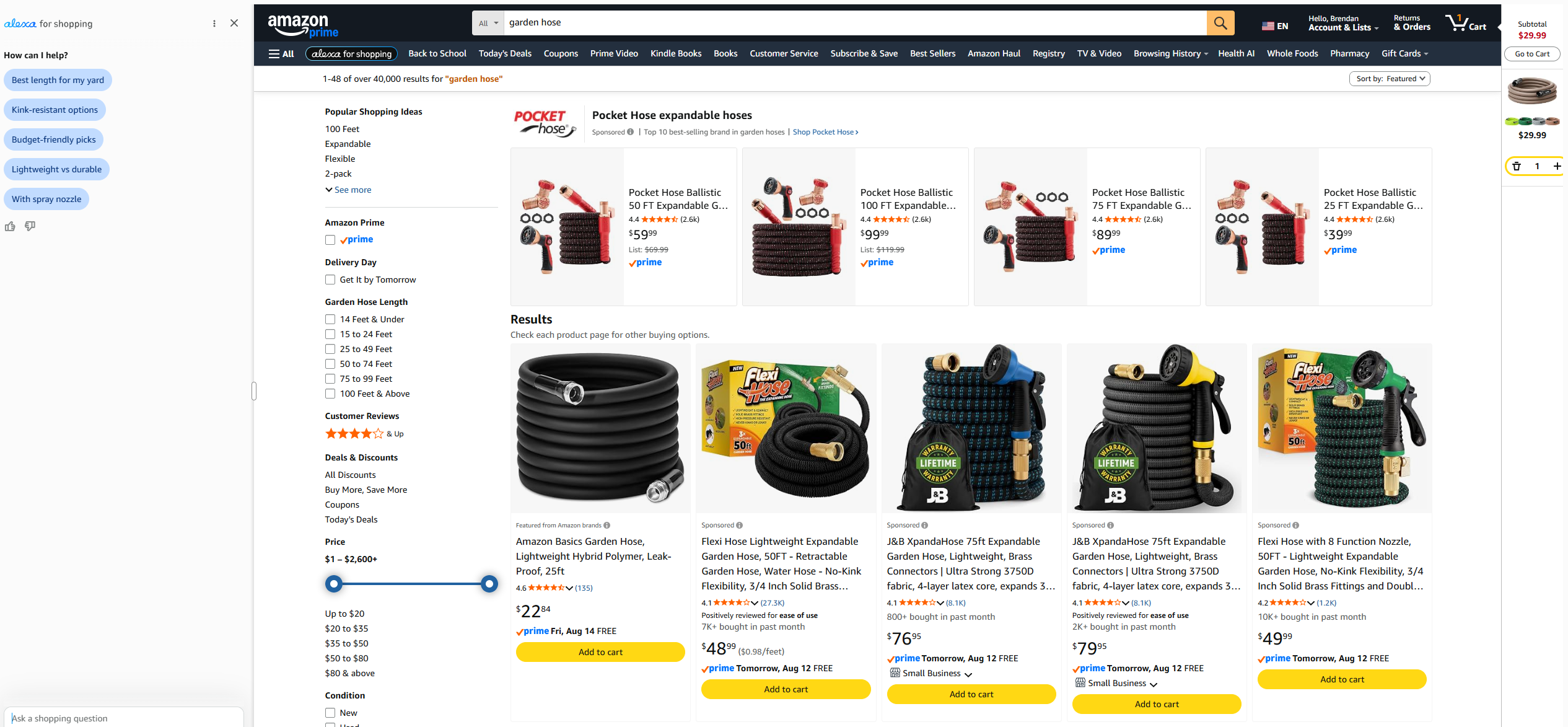
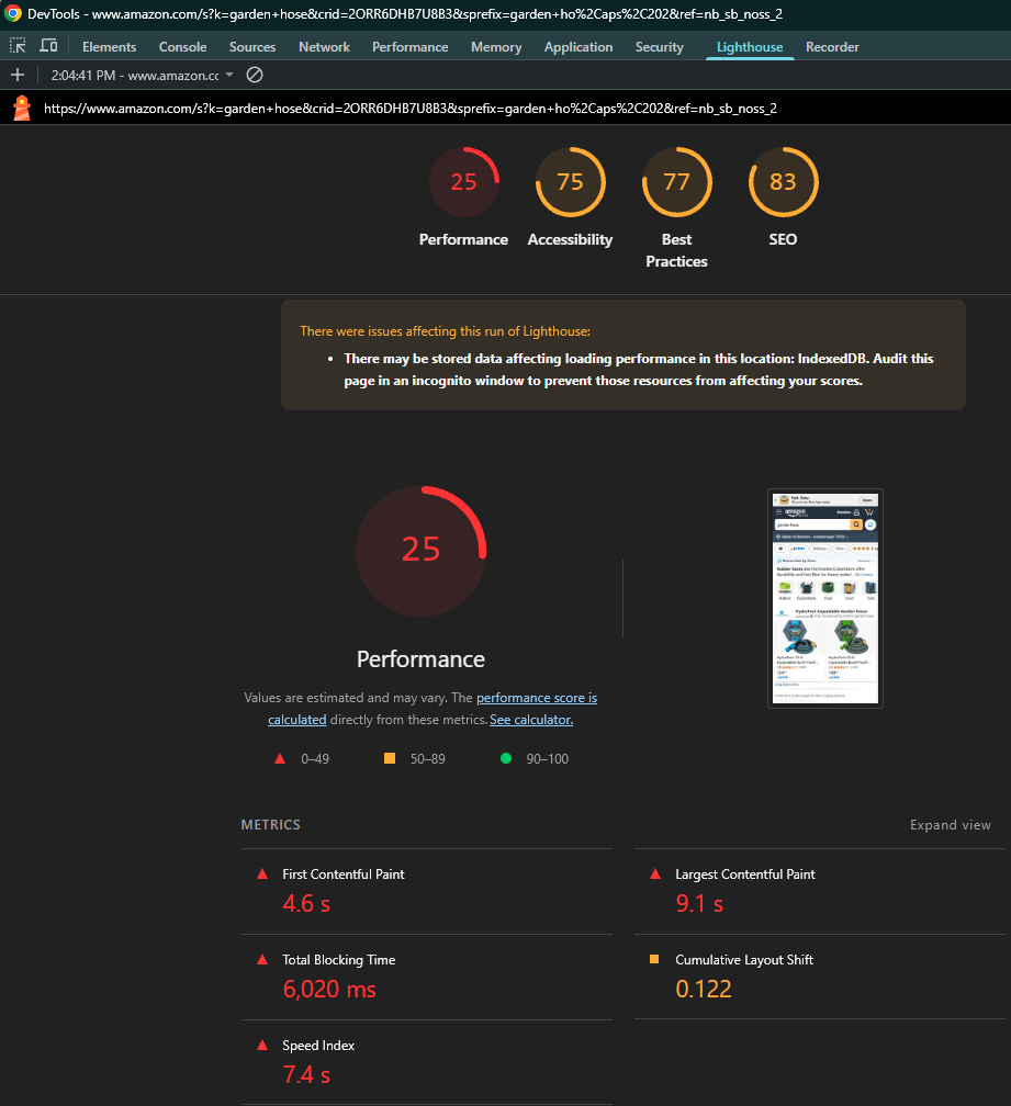
Where do we even begin with this? First of all, the performance is objectively bad.
There's noticeable load times on desktop, and the Lighthouse report is poor. This is pretty bad for a company as large and as successful as Amazon.
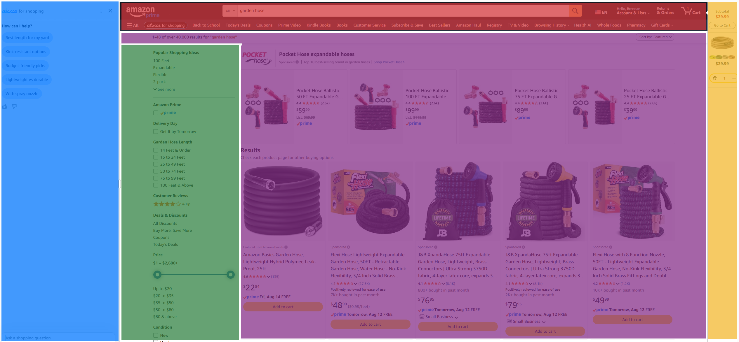
Second, there's just so many "regions" here to contend with, some vertical, some horizontal, some with tons of white-space etc. All five distinct regions compete for immediate visual attention. Perhaps most egregious of all, the user now has two competing left-hand columns: the alexa AI shopping chat interface (blue), and the classic functional filters that have been around for a long time (green).
Now, go to McMaster-Carr. I know it's a little unfair to compare Amazon to an industrial supply company, but both of them have similar designs and sell hundreds of thousands of distinct products.
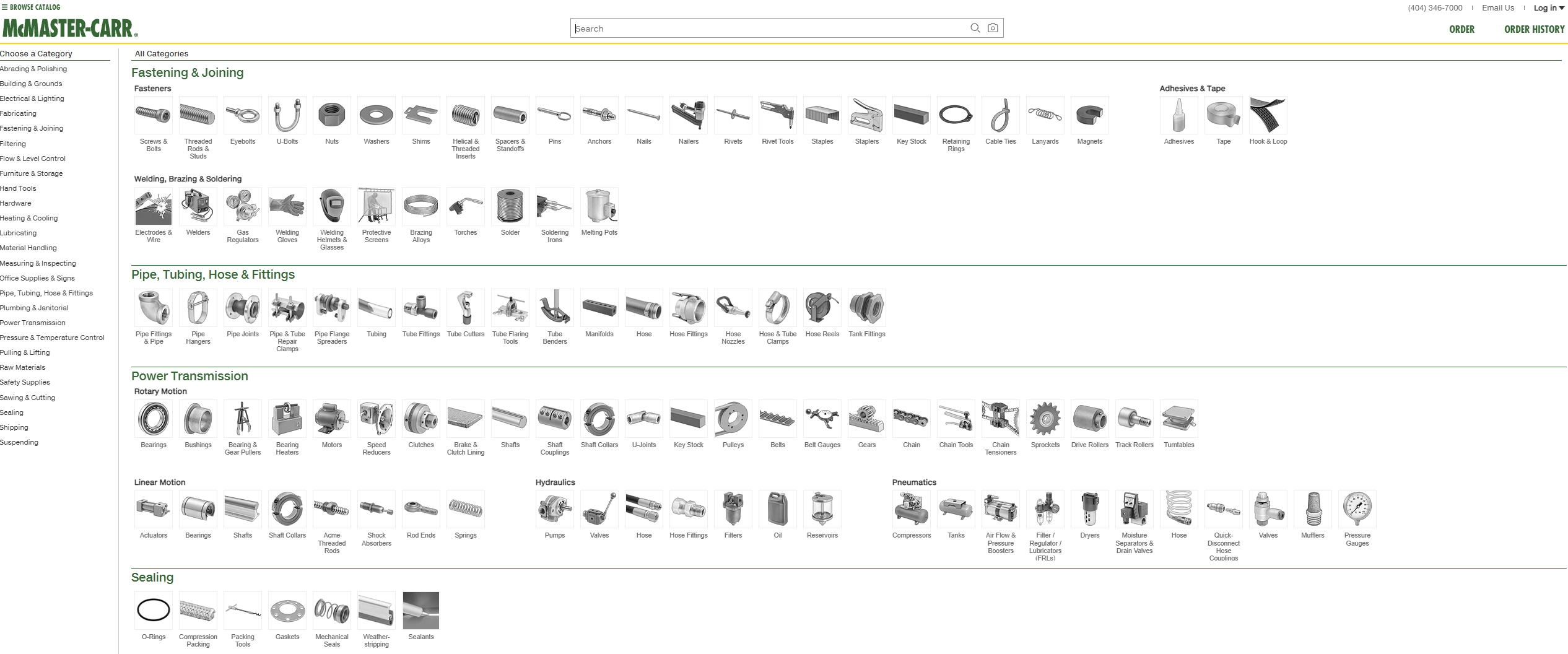
Even if we broke this page up into regions like we did with Amazon, I can only identify 3. The header, the side-bar, and the main panel.
The lighthouse report is much better.
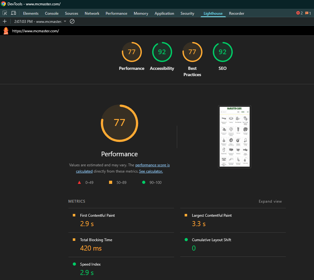
The site loads instantly. It consists of high-density text, logical hierarchical categories, intuitive filtering, and zero unnecessary fluff. You find the exact part you need in seconds or minutes at worst. You could theoretically add it to your cart, and check out before a bad application (one worse than Amazon, they're out there!) might finish loading their first JavaScript packages. There's dozens of youtube videos of web folks analyzing this website and it's design and performance considerations.
McMaster-Carr is a great showcase of form over function, and of utility over beauty. It serves as a reminder of a truth software engineers and web designers keep forgetting: function beats novelty every single time.
The Problems
To understand how the modern web became so bloated, we need to examine two well-documented patterns in software development and project management.
1. The Second-System Effect
Coined by Fred Brooks in The Mythical Man-Month, the Second-System Effect describes the dangerous tendency to over-engineer a product when rebuilding it from scratch.
When a team builds version 1.0 of a system, they are cautious. They build the core functionality, cut scope, and get it working. 1.0 is almost always a minimum viable product. Functional, maybe a little too bare-bones, but it works. The proof of concept makes it to production, and proves that it can work. But version 1.0 always leaves behind a list of small grievances, ideas, and "nice-to-haves" that didn't make the cut.
When it comes time to build version 2.0 (the second system), the team pours everything they suppressed into the project. They add more complex features, customizations, and whatever else comes to mind. The result is often an over-designed, fragile mess that is far harder to maintain than the "ugly" original. Obviously this can be avoided with enough discipline, but the second-system effect is very real.
If a web application is working and serving its users effectively, the best decision is often to leave it alone. If it ain't broke, don't fix it.
Or in less catchy phrase: if your end-users aren't complaining about it, don't fix it.
2. Gold Plating
In project management, Gold Plating refers to adding unnecessary features, visual polish, or complex functionality beyond what was requested or required.
Engineers and designers fall into this trap constantly because we love to solve hard problems and make things look sleek. We swap plain HTML forms for more complex web component frameworks. We replace native web features with custom Javascript libraries. We fiddle with the CSS and theme. We add animations and spinners and emojis.
We come up with things to do so we can justify our job roles. I'm a web developer... so I must... develop web features?
Well, what if the website is objectively functional, arguably perfect? Now what do you do? Tinker and update. Even if nobody asked. Project managers excel at this. They invent work so they can manage the work, and then they push that work onto the designers, and developers who then implement that vision. The vision that, again, nobody asked for.
More often than not, none of these additions help the user complete their primary task faster. Instead, they introduce accessibility problems, and performance degradation. Gold plating turns straightforward tools into sluggish experiences.
Even worse, sometimes these designs are done purposely. They implement dark patterns to slow you down on purpose. Amazon might not want you to find your ideal garden hose in <15s. They want to you get stuck on a page, be shown ads, shown other related products and hope you "window shop" and spend more money as a result. This same pattern is true in real life as well with stores engineered using "choice architecture" to maximize the amount of time and money you spend inside. The longer you stay in a store, physical or digital, the more likely you will spend money there.
The Unattractive Solution
There's a solution to both of these things: simplicity. Keep it simple, stupid (KISS). Let things be worse on purpose because your perception of "bad" vs "good" is probably incorrect anyways.
Worse is Better
In 1989, computer scientist Richard P. Gabriel wrote an essay introducing the concept of "Worse is Better". He contrasted two design philosophies:
- The Massachusetts (MIT) Approach: Strives for absolute correctness, completeness, and architectural elegance. The implementation must be correct, even if it requires extreme complexity.
- The New Jersey (Unix) Approach: Strives for simplicity of implementation and interface. It prioritizes getting a working system deployed quickly over absolute theoretical perfection.
Gabriel noted that the New Jersey approach ("Worse is Better") consistently wins in the real world. A simple, slightly imperfect tool that is fast, resilient, and easy to deploy will outcompete a complex, perfectly engineered system every single time.
Modern web, software development has drifted far into the MIT approach. We build massive abstraction layers and complex build pipelines just to serve static text and image assets. We have traded the raw simplicity of the early web for high-overhead complexity. These complex projects lead to technical debt in later years, require more employees to maintain, and generally fail harder and bigger than a more simple approach. Complexity costs more up front, and costs more in the long run.
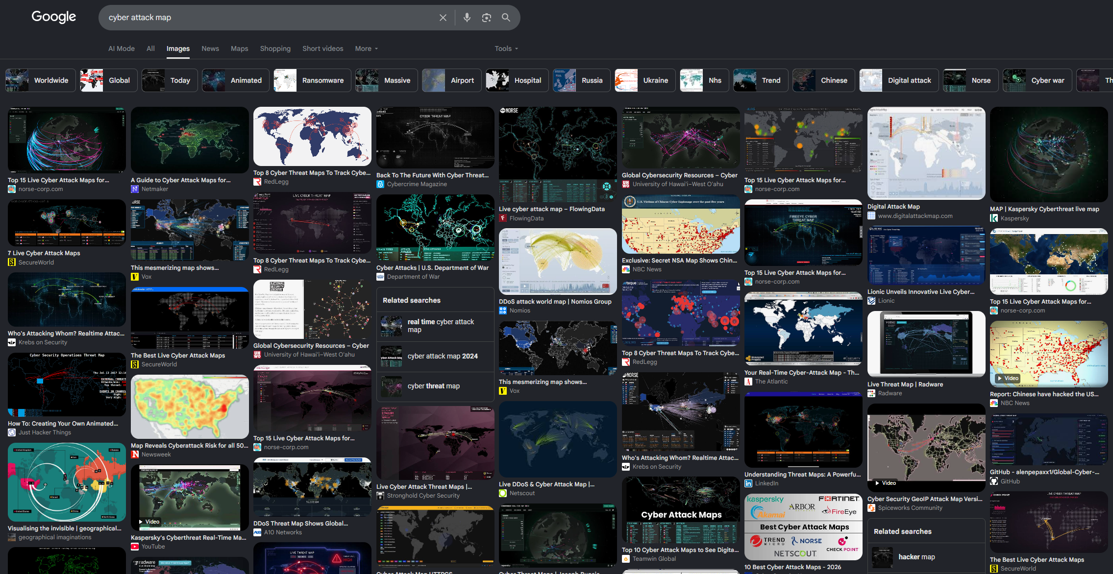
In cyber products, we often joke about these meaningless "pew-pew" attack maps. They mean nothing, and run fake data most of the time. It's fun eye-candy for a CEO with no concept of reality, but adding these to your product adds visual bloat and perfomance implications that actually negatively impact things. And yes, these are still a thing and very much real. I've seen some in product demos this year (2026).
Standardized UX is a Feature, Not a Limitation
There is a strange impulse in web design to reinvent established user interaction patterns. Every marketing team wants a "unique brand experience," which usually translates to non-standard navigation menus, search bars in expected places, and generally unexpected application behavior.
Jakob's Law of User Experience states that users spend most of their time on other sites. This means users expect your site to work the same way as every other site they already know.
When you adhere to established UX patterns, users don't have to think about how to use your interface:
- A search bar at the top of the page should look and act like a search bar.
- Blue underlined text should be a clickable hyperlink.
- Form inputs should use native browser field validation.
- Back buttons should navigate back in history without breaking routing state.
Deviating from these patterns to be visually distinct usually adds friction. If you want to get crazy with a website it's okay for a personal blog or a portfolio or something much more niche. But if you are designing the application for many users, you must stick to the established patterns.
The Industrial Web Standard
McMaster-Carr, Craigslist, and Wikipedia all share a common trait: they refuse to participate in design trends.
They do not use floating pop-ups. They do not hide navigation options behind mysterious hamburger menus. They do not load megabytes of framework code before showing you a sentence of text. They treat the user's time and bandwidth with absolute respect.
Embrace simplicity.
Or just use lynx.